Pages

Friday, 25 April 2014

Artist Sheets...

As part of my project I have been researching various artists/ designers to support my FMP. I looked at artists who inspired my floral theme such as Ernst Haeckel, Christopher Kane, William Morris, Cath Kidston, Jill Flower, Corrine Young and many many more. All these people are involved with art, craft, fashion, textiles and other artistic talents. I created two artist research sheets size A2 on William Morris, Ernst Haeckel and Christopher Kane. These artist/ designers inspire my project on floral design.


My first artist sheet was on William Morris who was a print artist who studied and drew flowers. I created a sheet based on him because his works really inspires me as I am also inspired by my surroundings. He was one of the most iconic designers of his time and is still a massive influence in today's textile design. I created this sheet with collaged images, and fine liner. I tried to recreate his patterns as well as giving it my own artistic twist. I really like how this sheet turned out because its simple but looks really effective.

My second artist sheet was based on Ernst Haeckel who was a German biologist who drew and discovered many species of plants and animals. I also based it on Christopher Kane who is a fashion designer who uses the biology of flowers as the main focus of his designs. Both artist/ designers go perfectly together as they both focus on the biology side of things but offer it in totally different ways. I did this sheet by drawing the inside of flowers in the centre of the page with watercolour to make it the main focus. I then used the artist/ Designers work to collage the rest of the sheet. I really like how Christopher Kane uses the flowers as a stencil cut out on his fabric, on other garments he uses prints of flowers finished of with sequins. On some outfits he even labelled the designs with flower biological names. Finally I wrote the Latin names for some flowers and flower species. I like this sheet because its bright and colourful and mixes science and fashion together.

Wednesday, 23 April 2014

Development Sheets...

These sheets are the final stage to my design ideas, the patterns and images on these sheets are what I want to turn into a screen ready to screen print onto fabric for my samples and final piece. I am still unsure what I want to create yet but I want to incorporate these designs on my development sheets with my final piece/s. On these sheets I have developed my visual sheets by adding more colour and pattern and combining both visual sheets onto my development sheets, I have used media such as gouache paint, ink, and fine liner. I am really pleased with the outcome of these sheets because the colours look beautiful together and would look great on printed fabric for any purpose. All sheets are A2 size.


This sheet also has a cultural/Indian feel to it, I mixed red and blue ink together to create the purple background which dried like varnish. I then sketched out the flower in pencil and painted each individual sections carefully with gouache paint which I also mixed together to create pastel colours. I then finished the sheet off by adding metallic gold paint polka dots to the rest of the sheet. This is my favourite sheet because it captures the beauty of contemporary floral design. Surprisingly I completed this sheet quite quickly.
This sheet has a beautiful Indian feel to it. This sheet is done using gouache paint, fine liner and nail polish. Even though this sheet is quite simple I think it looks really effective with the contrasting colours and patterns. I put glue on top of the stylised flowers because the paint was beginning to crack slightly. I took the idea of the leaves and decided to create a screen with leaves on for my final piece prints.

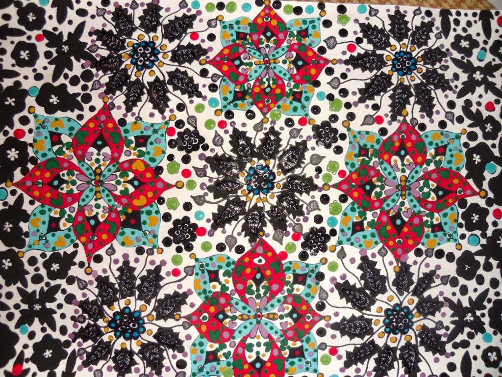
This sheet combines both my visual sheets together in one to show how I've developed my overall design, the use of colour looks quite striking with the black paint, I used fine liner, and gouache paint. I completed the design with multicoloured painted dots. I like this sheet because I was making it up as I went along and it turned out really cool, basically I experimented. I'm still unsure what design I should go forward with because I have too many ideas. However I feel I have strong designs that could be used for a lot of printed textiles.


Visual Sheets..

I decided I wanted to base my project on contemporary detailed floral design. When doing these visual sheets I wanted plenty of colour and pattern. I wanted my work to look quite cultural offering many interpretations and emotions. My main source of artist inspiration came from one of my favourite artists William Morris whose work captures my attention every time I look at it. I love his use of colour and detail. I decided I was going to combine my own artistic ideas and his work but to put a modern twist on floral design. These sheets include media such as fine liner, paint and nail polish. I am pleased with these two sheets overall but they took along time to complete. All inspiration came from my mood boards combing both traditional and contemporary floral design and from my artist sheets. Both sheets are A2 size.


This sheet looks quite cultural with an Indian feel which was unintended, I mixed blue and yellow ink together to make green which I used for my background, when it had dried it looked like it had been varnished which made it look even better. I sketched out the flowers first in pencil and carefully painted each small section in various colours of gouache paint and attempted to make each flower identical. I then completed the flowers by adding coloured dots and metallic gold dots to the background. The gouache paint gives it a velvet 3D effect due to experimentation. This sheet was tricky to paint because the sections were so small and I had to have a really steady hand.

This sheet looks quite gothic but striking. I wanted the blues and blacks to stand out against the plain white background, I used fine liner to get the accuracy of the flowers and paint for the blue and white flowers. I completed the sheet by putting purple nail polish polka dots all over the sheet to give another splash of colour. At first this sheet went wrong and I had to cut out the main flowers and stick them on another sheet which made the sheet quite thick, however it turned out alright in the end.

Mood Boards...

I created four mood boards to show my inspiration and ideas, on these sheets I have shown many interpretations of floral beauty with plenty of media and colour. I used collaged wallpaper that I got from a shop as well as other media such as Gouache paint, Batik, nail polish etc. All inspiration is taken from observation of my surroundings and the book ' The Language Of Flowers'. I'm really pleased with my mood boards because they gave me a lot of ideas and inspiration to take further on into the project. All sheets are A2 size.


This sheet captures the meanings and emotions of flowers, and is based on the book I am researching, each image represents a flower and its meaning, for example 'Lily' which means 'Purity'. I completed the sheet by painting flowers over the images to give a beautiful effect.

This sheet is based on contemporary floral design, I've collaged a vase of flowers with modern floral wallpaper. To complete the sheet I used a batik flower background with procion dyes and white polka dot paint. The batik background when held up to the light reveals a stain glass window effect which is stunning.

This sheet has both contemporary and traditional floral imagery (wallpaper) simply collaged on a pink and black polka dot background, however the simplicity of it creates a stunning piece of artwork  itself.


This sheet is vibrant and beautiful using simple collaged wallpaper imagery. The colours really compliment each other giving it a sense of happiness in the fresh breeze of summer. I finished of the sheet by painting small Daisy's around the images using gouache paint.