My evaluation
When asked to do this project my first step was to gather
primary research. To do this I took photos of nature and manmade objects around
the house that inspired me. I also took photos of the drawing setup in college
and from that I sketched many of the objects as part of my observational
drawings. This was a strong start to my project because I had plenty of
research to work with. As part of my secondary research I collected wallpaper
samples from various shops as this was a repeat printed wallpaper project. The wallpaper
samples definitely inspired me because I started to look at patterns and
colours that each piece had to offer. I also collected images of nature and
manmade such as animals, buildings, insects, weather, seasons and floral
landscapes. As further development I looked at the intricate detail in insects
such as butterfly wings and patterns in animal prints. I took inspiration from
flowers and the detail that was on them, and when I looked at colour schemes
weather and landscapes they had plenty of beautiful shades of colour to offer.
I looked at buildings and the geometric lines that were in architecture; I
decided to go down the nature root as this fitted me a lot better. I think
nature has a lot of beauty in everything because there is endless detail and mystery
all around us that inspires me tremendously. Also there is every colour of the
rainbow everywhere you look; this meant there were no limits to what I could do
with this project. I developed my research by creating a sketchbook to store it
all in, I started to draw and use different techniques to re-create what I had
observed around me, this mainly included floral designs. I used media such as Berol
fine liner plus water, paint, and batik. Each drawing looked unique because I had
experimented with different patterns and media. I then did observational
drawings using various media which helped me decide my theme of nature. This
exercise helped me with time keeping and concentration because we had a
specific media we had to use and only a certain amount of time, this helped me
with my experimentation skills further on in my project. My favourite technique
that I took from this exercise was using a Berol fine liner pen and water to
make the colours bleed into blues, purples and pinks; I liked this technique
because it created a Japanese effect when I drew flowers, this looked really
beautiful. My next stage of development was to create mood board sheets, this
was collected images and sketches that inspired me all on mood board sheets, I
used media such as paint, fabric, printed images, pen and ink to create
different effects. Next I did my visual sheets which were a step further from
mood board sheets, these sheets had to include pattern and colour that we took
from our mood boards. I started to combine patterns with flowers and butterflies,
my sheets included most colours of the rainbow, the media I used was paint,
pen, ink, Berol fine liner with water. I then took detail and colours from my
visual sheets and took it a step further by creating development sheets which
had to combine everything to make a stunning final design. This is where I took
my floral design from for my final piece; the media I used for these sheets
were paint, pen, Berol fine liner with water and crochet material.
Choosing my colour scheme was quite simple to do because
everything about nature inspired me so I decided that my colour theme was going
to be multicoloured. This was a risky choice because my chosen colour scheme eliminates
quite a lot of rooms in a house because the colours a far too vibrant for
wallpaper in an every day room. Therefore I decided to focus on a teenage girl’s
bedroom because it represents the beginning of femininity, passion and energy.
This meant I could be experimental with the colours I used. The artists I
looked at to support my theme were Jill Flower who creates beautiful recycled
paper flowers in a very creative way, she adds gems and other crafty items to
her work to give it a unique touch. I also looked at Alexander McQueen who was
a well known fashion designer. A particular collection helped me decide my
theme because it was nature based and his clothing items included flowers,
bees, butterflies and other things. These two artists inspired me to go down
the nature route because they both translated nature in a quirky and unique way
and I felt I could do the same. As part of this project we had too complete
various weaving samples this included knitting, weaving (loom), weaving (peg
loom), felting (wet) and needle felting. In this project it was the first time
I’ve ever done knitting, I used 3.75 mm bamboo knitting needles. At first I
found it tricky to get the hang off it but my class mates helped me, I learnt
how to cast on, knit and cast off. After plenty of practise I became really
confident at knitting and produced some good samples. I found it very
therapeutic and have adopted it as a hobby. However when I used the bamboo
needles they felt like they could break easily so I bought some metal ones
which were a lot better. The next technique was weaving on a loom, at first the
machine confused me slightly but eventually I knew what to do, in the middle of
weaving I realised that a lot of white yarn was showing because I wasn’t
creating a proper pattern, I was just weaving randomly because I didn’t know
how to keep to a rhythm and pattern. This meant that it looked quite messy and
wasn’t a strong sample, I also found the process quite boring and time
consuming. However if I had more time I probably would have a good sample if I
had more practise. My next technique was weaving using a peg loom; this was really
simple to do because you just had to follow the pattern in figures of eight. I
used various materials to weave with which ended up looking really effective
and a strong piece of woven fabric. The process was very simple and creative
but unfortunately took along time to complete depending on the width of your
yarn or material. My next technique was wet felting, I really enjoyed this
process because I like how the fibres merged into a strong piece of fabric depending
on how much wool fibre you use. On each sample I created I made it quite thick
because I was going to use some of it as a foundation for needle felting. The
process was simple to follow and the more practise I had the quicker I produced
each sample, the only downfall I had was that my back and arms really hurt from
rolling the fabric repeatedly and it was quite tiring. Saying that the results
were really good, but on one sample I didn’t roll it long enough so the fibres
were still a bit lose when it had dried. I used string and scrap material on
some samples to make it more creative. When doing wet felting it kept shrinking
so I had to stretch it out carefully, it was even more difficult when I tried
making a flower on the design but eventually it looked really good. The next
technique was needle felting. I enjoyed this process because it created more
accurate detail; I simply stabbed the felt fibres into shape using a sharp
felting needle. I had a good time doing this because I created some really good
samples. The needle was quite sharp which was a bit scary, I tried using four
needles to get it done quicker but it kept getting stuck in the foam so I went
back to using one needle. This process took a while but was definitely worth it.
The final technique I experimented with was Tyvek, this was a plastic that I
melted away using an iron. This technique was quick to do and created a lace
effect, however I didn’t find the technique useful to my project and it was
quite boring. I also weaved with card which was easy but was a different kind
of weave. These extra samples were extra experimentation towards my project.
The elements I took forward into my design was everything to
do with flowers including sketchbook drawings, sheet work, photos, artist
inspiration, flowers I created on felt. The things I took from this were colour
ideas and patterns. I decided to take inspiration from all these elements to
inspire me with my designs because I started to develop a simple floral pattern
into something amazing. The experimentation I did throughout this project
included using different media such as paint, oil paint, pen, ink etc. As well
as my woven samples I created numerous wallpaper samples, this was the final
stage of my development for my final piece, I looked at numerous artists to
help me with my project, an artist that helped me decide my final piece was a
woman called Helen Pakeman she is a lino cut artist. I decided to do something
different for my wallpaper print rather than doing a screen print so I settled on
doing a lino cut, Helen’s work inspired me because her work looks quite
abstract and unusual and would look perfect if I did my own version for my
wallpaper. When making the lino cut I simply drew my floral design onto it and
carved it out using a V shaped lino cutter, there are different shaped lino
cutters but the V one made it easier to carve with. This process didn’t take
long to do and was quite easy, now I was ready to experiment with printing. The
samples I did were mainly on lining paper but I did a few on black card and
brown paper to experiment more. On some I left a plain background and on others
I dyed them with Brusho ink, Procion dyes and inks so that each sample would
look completely different, because my colour theme was multicoloured I had
freedom to experiment with loads of colours. My lino was in two pieces (The
flower and the border) this meant that I could use different colours for each
print. On some they were very simple but effective and on others they were quite
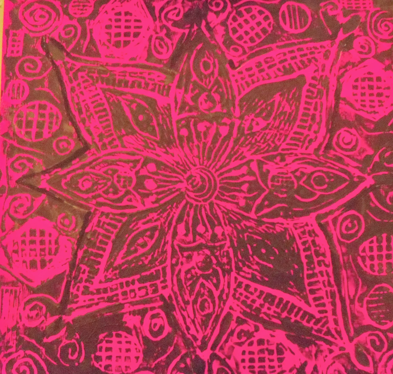
busy. I found that the ones that had darker prints on them were the most
effective because the detail showed up clearly. However each print was good in
its own way because they were completely different. On the dark backgrounds I
used pastel pale colours and on plain backgrounds I used stronger colours. The
problem solving I encountered was my lino was quite difficult to print with
because it was quite flimsy so I decided to go to wood work and have a wooden
frame stuck on at the back. However when I came to washing the lino the wood
started going soggy meaning I couldn’t wash the lino properly which was
essential to getting a clear print. So I decided to peel away the wood so that
I could wash it properly again, but because of this the ends of my petals
started coming off because they were too thin. I dealt with this problem by
filling in the petal ends after I had printed using a paint brush which worked
out fine. Some of my prints were too busy meaning that you couldn’t see some of
the detail, people had mixed opinions about it saying it was effective and some
saying it was too busy, as these were just experimentation samples I just
decided to leave them and learn from my mistakes when it came to the final
piece. Another problem I encountered was using oil paint, the oil paint dried
up too quickly so when I came to putting it through the printing press it
didn’t print clear at all, in result of this I found that using my own strength
and normal ready mixed paint gave far better results than the proper process. I
learnt that by washing my lino each time I printed it would leave clear prints
rather than clogged up ones where the paint has filled all the detail in. In
this project we weren’t aloud to choose our final piece so we had a design
meeting. We got put into groups of four and each had some decision sheets where
we wrote comments about each others samples and which one we liked best. When
they came to deciding mine they picked three favourites. I explained to them
that one of there favourites might be really tricky to replicate because the
colours were already mixed, and I didn’t have any of the paint left which is a
fault on my part. Eventually they all agreed on one design that they also
really liked. I was happy with there decision, it was simple but striking
because it was a plain black print on top of a deep pink and the contrast in
colours were stunning. It was now time to start my final piece; I started off by
cutting a meter of lining paper I then went to the print room to dye the whole
background with Red Mx5B Procion dye which is a deep pink colour, this colour
represents unconditional love and nurturing which I found quite appropriate for
a teenage girl becoming a woman. I then let it dry, using a hairdryer to finish
it off, in the print room I wore an apron and gloves to protect me from
spillages and chemicals, also the technician had to mix the Procion dye for me
as it was too dangerous. I then got my pieces of lino and rolled black ready
mixed paint using a paint roller to spread an even covering of paint. I then
printed the lino pieces separately because they weren’t attached. I kept doing
the same process till the whole sheet was covered. The whole print turned out
perfect and I was pleased with the result, it fit my theme perfectly and was
very striking as a feature wall length of wallpaper for a teenage girl’s
bedroom. I was asked to do another wallpaper sample to stretch my skills even
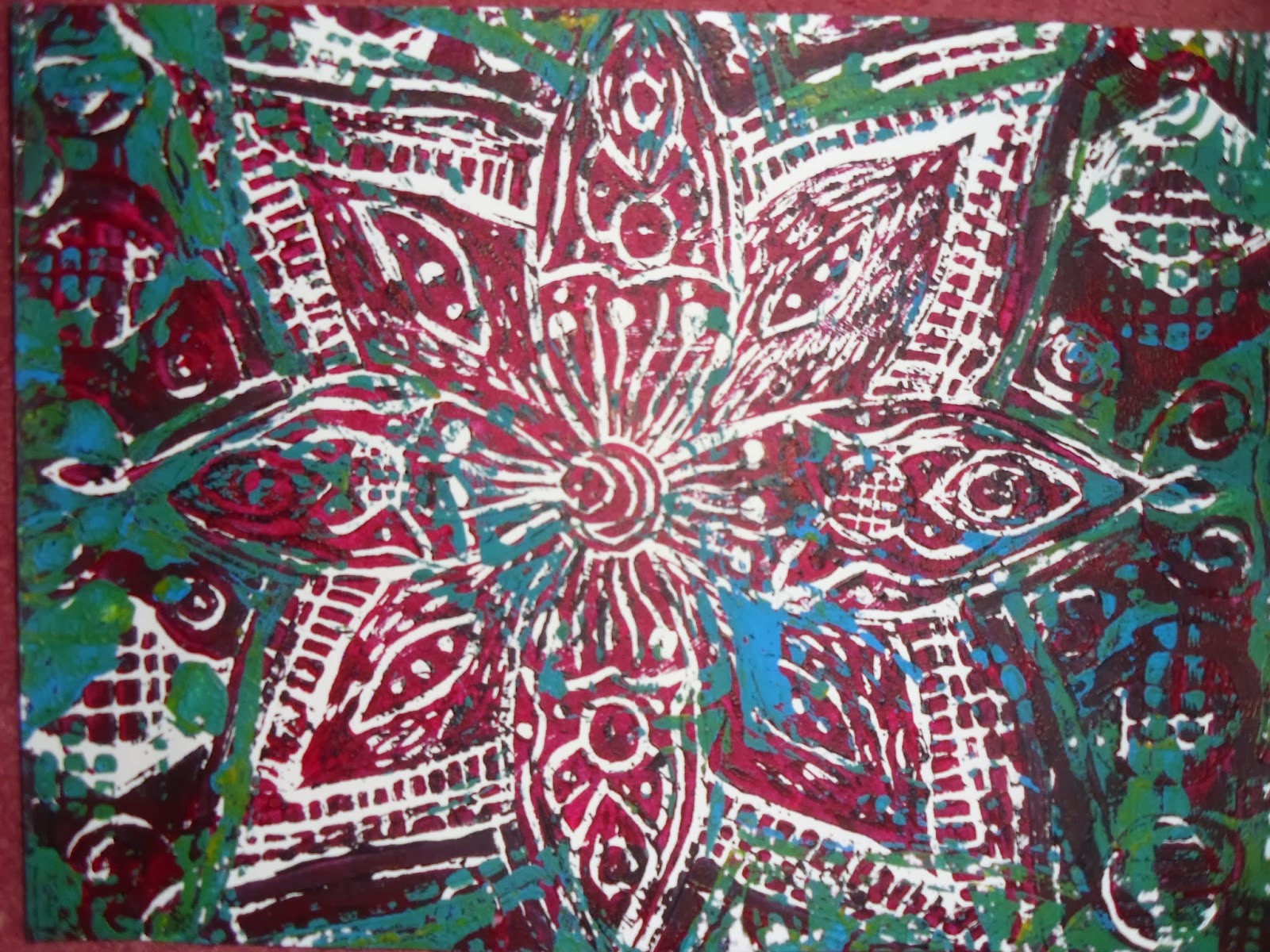
further, this time I was only printing on half a meter due to time. I picked
another sample that I really liked so I was going to try and replicate it. I
started off by dying the background using turquoise Brusho ink, I then dribbled
Red Mx5B Procion dye onto the background, and this looked really good because
it bled into different colours such as pinks and purples. Once I finished the
background I dried it with a hairdryer which spread the colours into each other.
I then got my lino and rolled orange paint on first and printed it and then
rolled yellow paint and printed it on top of the orange; I mixed the orange
using yellow and red paint. This gave it a 3d effect. I did this same process
till the whole sheet was covered. Some of the prints were blurred and you
couldn’t see the detail properly which was disappointing, I realised that it
was a lucky print that only worked well on my sample. Rather than throwing it
away I decided to do something brave and print just the flower in certain
sections of the wallpaper, I decided to use a bold black paint to really stand
out on the wallpaper, and this was a risk worth taking. Once I had printed
everything I realised that all the prints, even the messed up ones really
complimented each other and it turned out to look amazing. The soft yellows and
oranges against the blue gave it a hippy and vintage touch with a strong black
print to make it really stand out. By problem solving it turned out even better
than I could imagine because now I could see a beautiful soft background with a
detailed print on top. I had to do a woven sample to go along with my final piece,
I decided to make some felt as this was one of my favourite processes, I used
warm yellow felt fibres to complete the sample. To make the sample special and
unique I decided to needle felt some ladybirds on top of the felt. I did this
to go with my final piece because it related to my nature theme and
complimented my wallpaper piece. This went very well and was quite easy to do.
The processes I used throughout the project included lino print, batik, ink, Procion
dyeing, painting, knitting, melting Tyvek, weaving with a loom and peg loom,
needle felting and wet felting, felting using scrap material, ink and stick, Berol
pen and water, chalk, oil pastel and charcoal. My favourite of these processes
was printing with lino and needle felting. Most of my printed samples and
weaving samples went well along side my final pieces; the thing that went wrong
is my loom weave. My sketchbook, sheet work, final pieces were all successful.
If I could change anything it would be spending longer on my loom weave to
produce a better sample. I wouldn’t change anything else because I feel it has
been a very successful and rewarding project because I have learnt from mistakes
and improved them to a high standard. Other problems such as printing with oil
paint and using the print press, I couldn’t do anything about because it
produced poor samples.
I feel I used my time wisely because I managed to be up to
date with everything. However I was worried that my blog would be to a poor
standard because I did it quite late on in the project, but when I completed
it, it was very detailed and thankfully I remembered each process so that I
could write about it thoroughly. Apart from that, everything else went
according to plan; if I was to change anything about my time keeping I would
have started blogging earlier on in the project. I was very organised this time
and new what had to be done for when and I have produced a lot more work this
time than I did in the last project. I really enjoy writing my blog as it is a
reminder of all the processes I’ve done throughout the project, I find it
interesting and informative to look back at the work I have done, doing my blog
has helped me write my evaluation because I know what processes I did and at
what point I did them in the project. I feel I talked about each process in a
very detailed way for people to look at if they want to know how I’ve done each
process. Overall I’ve really enjoyed this project because it brought out most
of my skills and strengths because it was based on pattern and nature which are
my favourite topics. I feel I’ve delivered a really strong project and I’m very
pleased with the outcome. If I was to improve anything I would have researched
more about manmade items, and I would have done some more weaving using the
loom. Apart from that I feel this project was perfect for me and I have learnt
some fun techniques which I will carry on using throughout my life.
 |
| Second Final Piece. Layered colour lino cut repeat print, orange, yellow paint print, black paint print, turquoise Brusho ink, Red Mx5B Procion dye. Half a meter of lining paper. |
 |
| First Final Piece. Black paint lino cut repeat print, Red Mx5B Procion dyed background. 1 meter lining paper. |
 |
| Felt Sample to go with Final Piece. Yellow wet felt, ladybirds needle felt. |